Creating detailed and informative maps is essential for visualizing geographic data effectively. In this guide, we’ll explore how to use Cartopy, a powerful Python library for geospatial data visualization, to create various maps:
- Plotting a USA Map Highlighting Cities by Population
- Creating a World Map Colored by Topography
- Visualizing Global Earthquake Data on a World Map
- Mapping Global Temperature Anomalies
Each example includes Python code snippets to guide you through the process. Remember that the data used for this tutorial are dummy and made by suing some functions. My aim is to just show you how the plotting is done using the “cartopy” library.
1. Plotting a USA Map Highlighting Cities by Population
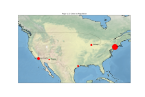
Highlighting major cities by population can reveal urban population distributions.
Steps:
- Collect data for major U.S. cities and their populations.
- Plot the USA map using Cartopy.
- Mark each city with a point size proportional to its population.
Python Code:

Explanation:
- Cities are plotted as red circles, with sizes proportional to their populations.
- City names are labeled next to the markers.
Note: For a detailed list of U.S. cities and their populations, refer to City Population actual data.
2. Creating a World Map Colored by Topography
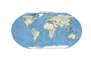
Visualizing global topography provides insights into Earth’s surface features.
Steps:
- Use Cartopy’s built-in features to access topographic data.
- Plot the world map with topography.

3. Visualizing Global Earthquake Data on a World Map
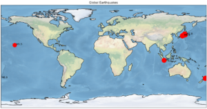
Earthquakes are geographically distributed, and mapping their occurrences can reveal tectonic activity zones.
Steps:
- Collect earthquake data with latitude, longitude, and magnitude.
- Plot earthquake locations on a world map using Cartopy, with circle sizes proportional to magnitudes.

Dummy Data for earthquake
Explanation:
- Earthquakes are plotted with circle sizes scaled to their magnitudes.
- Labels include the magnitude for better understanding.
Note: For detailed earthquake data, refer to the USGS Earthquake Catalog.
4. Mapping Global Temperature Anomalies
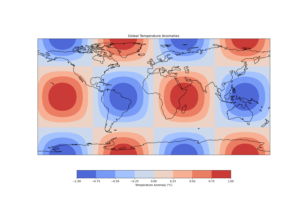
Global temperature anomalies can illustrate regions affected by climate change.
Steps:
- Use gridded temperature anomaly data (e.g., NetCDF format).
- Plot data as a heatmap on a world map.

Explanation:
- A contour plot represents temperature anomalies across the globe.
- The
coolwarmcolormap highlights positive and negative anomalies.
Note: Use real-world datasets, such as those provided by NASA or NOAA, for more accurate analyses.
If you need more tutorials may be using geopandas, which is better I believe, Please let me know in the comments. Thank you for reading.